
It’s tempting to think that some people are good at talking up their accomplishments, simply because it comes more naturally to them. While that may be true for some (cough, every guy who ever stole your idea in a meeting), I’d argue that for most of us—especially women—talking ourselves up seldom comes easily. Truth is, many people don’t do a good job representing themselves. Because of the way women are conditioned by society, most of us are basically professionals at downplaying our skills. So when it comes time to represent the full epic versions of ourselves? Well, I mean, forget it.
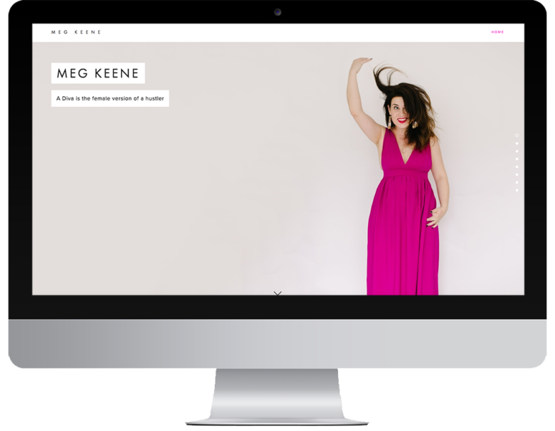
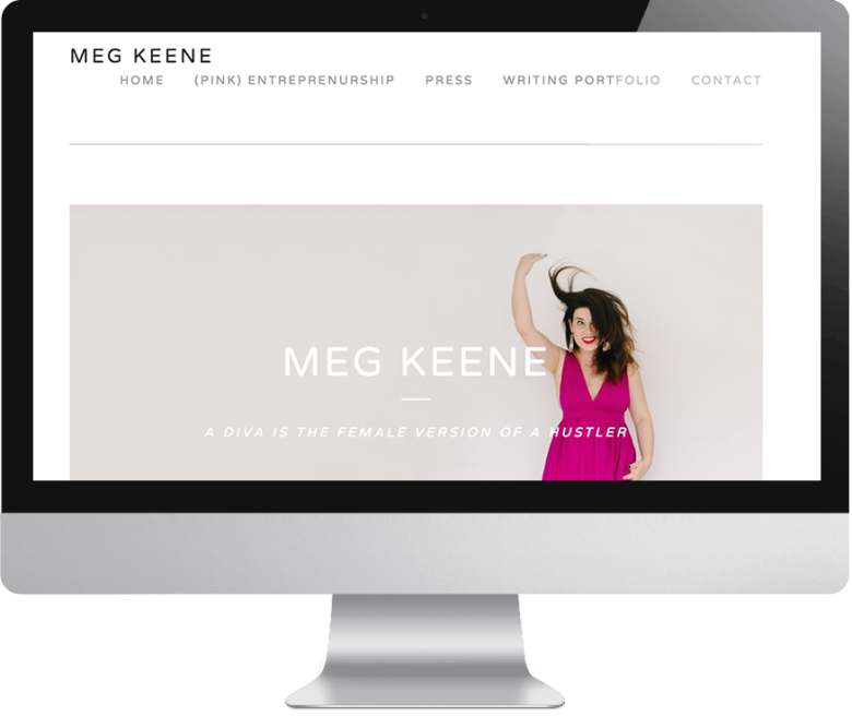
So when it came time for APW’s founder and CEO Meg to set up her website with Squarespace, she was in the exact same boat most of you are probably in right now. Did she even need one? Wasn’t APW kind of a portfolio in and of itself? And did she really have to write about herself? UGH. I mean, you all know that friend who responds to, “What do you do?” with, “Oh just some knitting stuff,” and you have to step in and be all, “What she meant to say is that she’s a serial entrepreneur geared toward eco-friendly yet accessible products and creating opportunities for marginalized communities. Her current project is running a successful hat knitting empire with only local rainbow wool that comes from organic farms, owned and staffed solely by gay women.” You know, that tendency toward downplaying what we should be singing from the rooftops? Well, it turns out that tendency can really shoot you in the foot when you’re building your personal website.
All of which is to say, even though I wouldn’t say Meg is bashful IRL, I can’t stress enough the fact that even outspoken, badass feminists can have this issue. The absurdly high occurrence of female executives with imposter syndrome proves it. So while I can’t give you a whole rundown on how to create your own personal brand (I’m sure you have accomplishments worth shouting from the rooftops, but that’s another article for another day), I can give you a breakdown of four issues I found with Meg’s portfolio site that are both super common… and can dramatically change how someone experiences your personal website (and in turn, how they digitally experience you).
Am I going to help her fix these issues, so y’all can see a before and after? Of course. But the first step is just figuring out what needs fixing. So let’s dive into it.
1. MAKE IT EASY
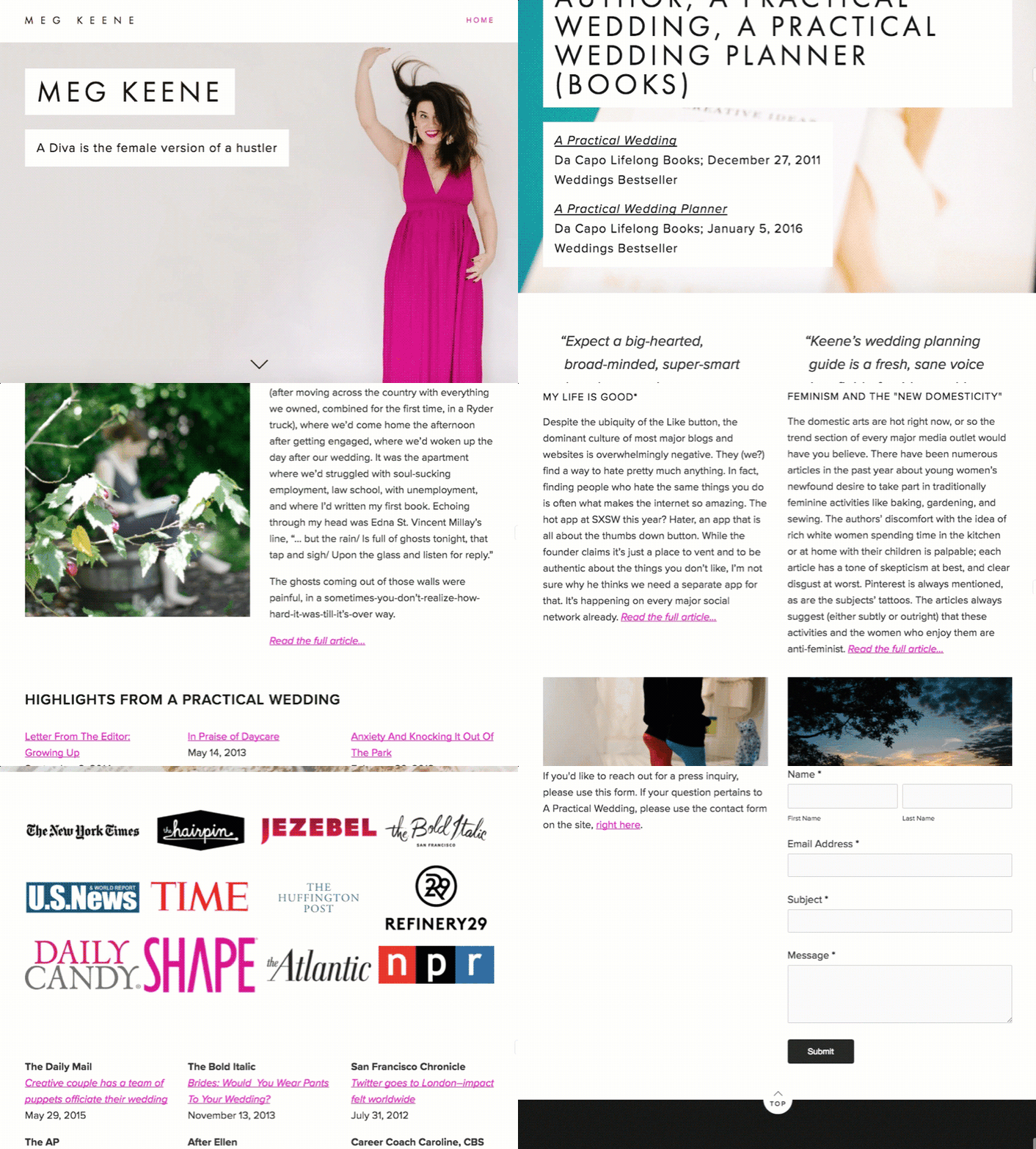
Right now, there’s only one way to experience Meg’s site—you have to scroll down from section to section. And while that’s great for creating a story with your website (we originally adapted this template from one designed for restaurants), is it helping people find the information they want about Meg? Or highlighting her best work first and foremost? What I’m saying is, don’t hide your accomplishments! Anticipating why people are trying to find you (Do they want to see a bio? Your recent works? How to hire you? What other people think of you?) and then making it dead easy for them to get there is tantamount to being seen properly.
One of the best things about Squarespace is that your subscription automatically includes every template they have, and you can swap your layout with one click and not change any of the information on your site. So you can circle through a bunch of different options before figuring out which one works for you. Meg’s current scrolling template, for example, was a really new format when it first launched, but since creating her site, Squarespace has rolled out tons of new themes. I recommend that she think about what she wants to say about herself and then try a few on for size. Does she want to try the aptly named Keene template and include a front page navigation that tells you exactly what she does best and how you can hire her? Or does she want to show off her recent work more visually with something like the Momentum theme? Maybe she wants to use one of the templates that includes audio so she can showcase some of her recent podcast appearances?
2. YOU ARE NOT WHERE YOU WORK
I don’t care if you’re an employee or a boss, new or dedicated twenty years to the company—you are not defined by your paycheck. Let’s take Sophia Amoroso. Yes, the fact that she built a huge retail empire from an eBay store is impressive. But when she lost her job at Nasty Gal, and they promptly went bankrupt, she was still a name (and a force) of her own. (And pro-tip: She relaunched her newest venture, Girlboss.com, with a Squarespace website.) So how do you position yourself that way… even if you love your job? Or particularly, if you’re a powerhouse who is currently un- or underemployed (and we know you’re a powerhouse).
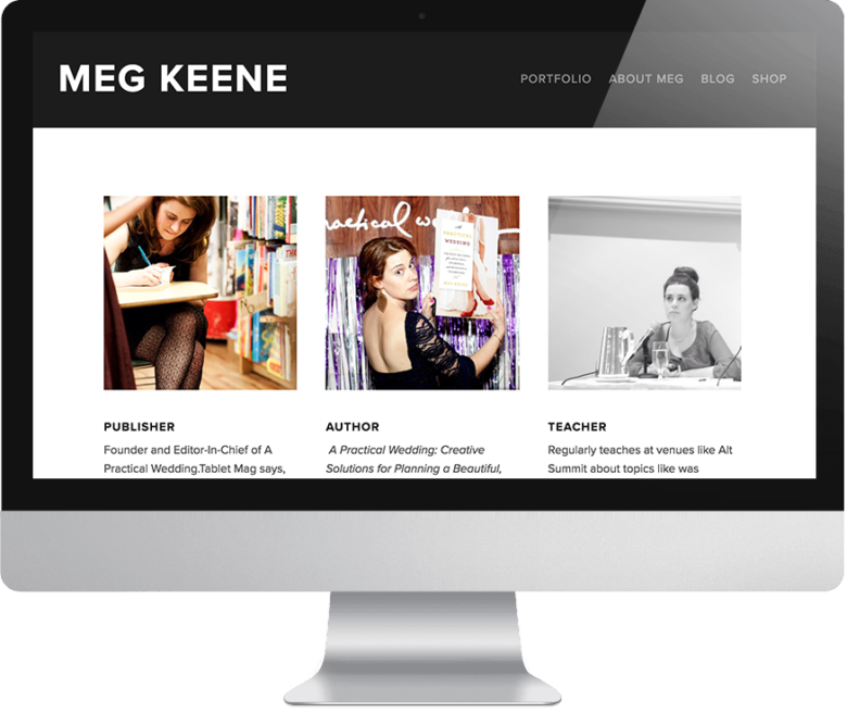
Who you are and what you aim to accomplish in this world should always precede the where you work spiel. Meg’s first sentence on her site says, “Meg is the founder and Editor-in-Chief of A Practical Wedding.” So let’s say APW folded… then is Meg nothing? This isn’t the APW about page, this is her site. I challenge Meg (and everyone) to change this pattern of thinking. I’d shift the wording to say, “Meg is an entrepreneur and writer who has dedicated her career to solving problems and creating digital communities of smart diverse women. She’s currently founder and EIC of A Practical Wedding, and she speaks as an expert both on the wedding industry and all aspects of running and scaling a successful self-funded media business.” BAM.
3. DON’T PLAY COY
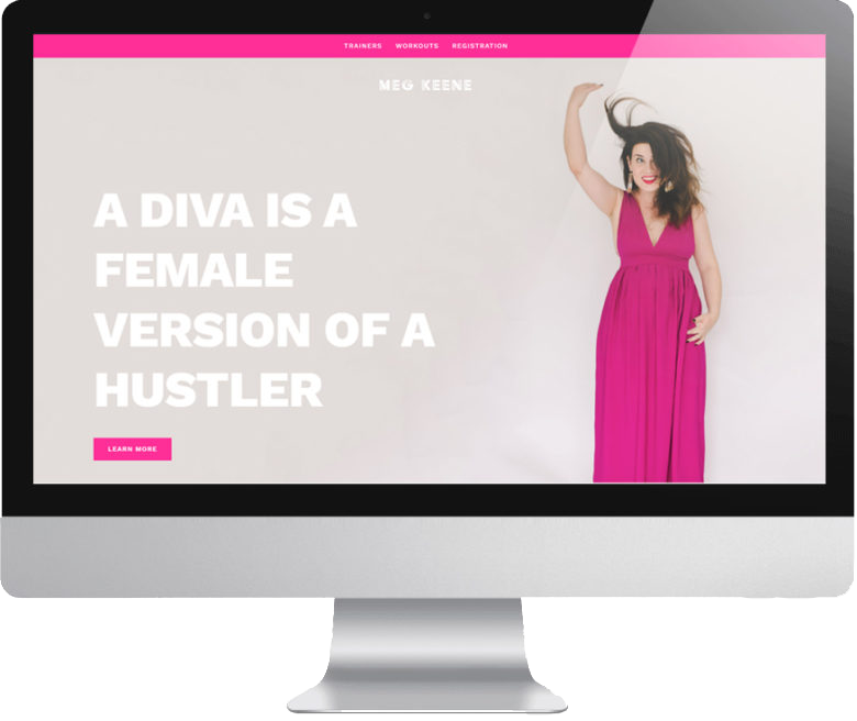
Unless being unreachable and mysterious is a huge part of your brand (and that’s a very, very specific type of brand), you need to open multiple ways in which someone can reach out to you. Of course you need boundaries: some high-profile people keep their personal emails private, some folks don’t use Facebook and turn off messenger on their business page, etc. Just remember, not everyone is willing to fill out a contact form. (And luckily Squarespace makes it easy for you to include lots of different options for contacting you. You can include a contact form, link to your social accounts, and include email address if you want to keep it simple.)
As much as possible, make it easy for someone (particularly an important-to-your-career someone) to slide into your DMs. Speaking of DMs, if you have a social media account you use regularly that’s public and shows up on the first page of your Google results, you should probably link to it in your site. If it’s off brand, make it private or change the name to something less traceable. If it’s on brand? Show it off, front and center. For example, Meg is super active on Instagram, but her account is nowhere to be found on her website. She should add icons to any active public-facing social media channels next time she’s updating her website.
4. SHOW YOUR WORK
Remember in middle school math class when you’d write in the right answer and the teacher would still penalize you for not showing the method to your mathematical genius? My translation of that into branding becomes this: show what you’ve done, so people know how to work with you. Give a little #BTS action. As an expert in her industry, Meg is in an incredible position to be hired to teach, speak, keynote, and host. And she lists out the many, many times she’s done just that on her site, with a handful of vague titles. But you know what’s missing? Her work. The site is missing what she has to offer, be it sample talks and syllabi, or case studies of times she’s worked with brands.
For lots of small businesses and personal brands, this means having a detailed breakdown of services, case studies of working with clients, or just a behind the scenes video of how the magic is made. Just be careful not to show too much work. For example, Meg has sixty-nine press clips listed starting in 2011. That’s… a lot. And here’s a hot tip: If you’ve been quoted by the New York Times, had a viral story on Buzzfeed, and been on NPR quite a bit (all things Meg has done), I’m going to assume you’ve been in a lot of other smaller places. Frankly, I’d rather not wade through those less important press mentions to find the good ones. The same goes for other businesses. If you took ten great wedding shots, I assume you haven’t only ever shot ten weddings. I don’t need an exhaustive list, just a general idea of what you’re about. Leave ’em wanting more, as they say.
This is where you should let technology do the work for you. For example, if you’re afraid you’ll never update that section of your website (cough, all of us), Squarespace has it set up where you can automatically publish to, sync with, and import from Twitter, Instagram, Vimeo, and more. So if set it and forget it is more your style, that’s an option too. Or if you don’t want to have to update a full page layout every time you have a new announcement, you can always use their announcement bar feature to let people know you’re latest and greatest. But bottom line, by all means, show people the infinitely cool possibilities that lie in working with you. (Personally, I want to see Meg take advantage of the fact that you can now have a video background on your Squarespace website  .)
.)
The thing is, you’re awesome. You want that to come across. It might feel a little arrogant, you might be tempted to overcompensate with content instead of swagger… but don’t. What makes you (and, by extension, your website) slay is that it’s yours.
do you struggle to promote yourself? What’s holding you back from shouting your own name from the rooftops? Pro-tip: every Squarespace subscription comes with a free 14-day trial. So if what’s holding you back is a fear of commitment, GET ON THAT right now.

This post was sponsored by Squarespace. We are thrilled to be partnering with Squarespace again this year to talk about what it means to be a woman with hustle in 2017. If you’re looking to make a career change or kickstart one on the side, one of the best things you can do for yourself is create a home online where you can show off your work in the form of a portfolio site, an online resume, or another hub where you can display just how awesome you are. Squarespace provides the creative tools that make it easy to build your online home beautifully, even if you’ve never made a website before and have no idea where to start. Squarespace is offering APWers a 10% discount on your first purchase when you use the code APW17 at checkout. Click here to get your website started today with a free 14-day trial from Squarespace.
The post How to Talk Yourself up Like a Pro appeared first on A Practical Wedding: We’re Your Wedding Planner. Wedding Ideas for Brides, Bridesmaids, Grooms, and More.
