
Sometimes I worry wedding planning makes everything so meaningful and serious that we forget to have fun in the middle of, you know, planning a party. And I get it. Your mom is already bugging you about your “theme” even though you’ve been engaged for five seconds. And you’re suddenly taking stock of how to get what everyone wants with five or ten or twenty (or more) thousand dollars… an amount of cash you’re really not used to throwing around. How are you supposed to have fun?! But that’s why it’s extra important to take advantage of all the small wins you can get during this crazy time. Things like getting shiny gold invitations simply because you like them. Or wearing a pair of ridiculous shoes.
This year, while I was helping my friends plan their weddings, one of the more delightful places I saw them inject their personalities was in their wedding websites. A wedding website is sort of the perfect place to have fun, for a few reasons.
- It helps set the tone for your wedding. One of my friends dubbed her wedding “The Extravaganza” (a nod to her and her wife’s mutual love of RuPaul’s drag race), and it really set the tone for the over-the-top, fun, stylish wedding that followed.
- People (generally) don’t give feedback on your wedding website. So you can let your freak flag fly and not worry about getting that face from your nana you get every time you debut a new haircut.
One of the reasons I love working with our longtime partner Squarespace is because they make it super easy to inject your personality into your wedding website. And recently, they released four new templates (plus a whole slew of new features) that are 

 . So, inspired by my favorite of the new templates (aptly titled Vow), today I’m sharing my easiest tips for making your wedding website slay.

Have fun with photos
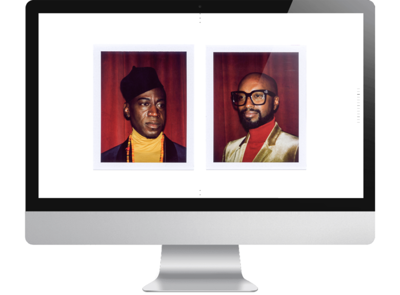
Squarespace’s designer templates are designed specifically to make photos shine (you and your partner are, after all, the reason for the season). But I get it, not everyone has professional photos of themselves just lying around, waiting to be inserted into a full bleed wedding website. Except, right now, my phone takes better images than my first professional DSLR. So take a tip from my recent holiday card experiment, and make some #lazygirl photos yourself (you can get a phone tripod with a remote off of Amazon for less than $15). And here’s the advice I use in my own work all the time: you don’t need to worry about making your photos perfect if you make them fun, because fun > pretty. (Also, as evidenced in the example above, velvet helps too.) Squarespace also recently added new video backgrounds to their wedding websites, and I’m dying to see someone try them out. (Check out the new Royce template for a super mesmerizing example.) I’m picturing live-action confetti throwing, you feel me? Or maybe some Lily and James Potter Boomerang vibes.

Use your words
What made my friend’s wedding website so fun wasn’t how it looked (though they made it with Squarespace and it was hella cute). It was how they described the event we were all about to attend. So while the first order of business on your wedding website is to make sure your guests can actually find all the information they need, beyond that, there’s nothing that says it has to be boring. (And pro-tip: It helps to pick a template that already has all those text areas built in, like Vow.) That friend who described her wedding as The Extravaganza? Her dress code read, “You look good, you feel good!” (Translation: step it up.) And if you’re looking for inspiration, Squarespace has already done the work of finding their most creative user examples (click here and scroll all the way to the bottom of the page for some really good ones), and there are no rules against plagiarism in weddings. So poke around, and then Frankenstein your favorite bits together. Copy and paste is your friend. There, I said it.

Make yourself known
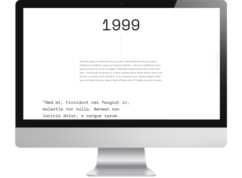
I know it can feel indulgent to include things like an About page or your relationship history on your wedding website. I mean, everybody knows you already, right? But for newer friends and people who only know one half of the couple really well, those sections of your wedding website can be a fun (and super useful!) way to study up before the wedding. So lean into it. Just the other day, Meg and I spent nearly half an hour browsing the website of a company whose staff pictures changed to baby pictures when you hovered over them. Why? I dunno, because it was fun. Squarespace makes it easy to add galleries to your wedding website, so instead of recent pictures, why not dig up some old photos of you and your partner, and let your guests really get to know you?
Whenever I see advice online that tells people how to make their wedding more personal, it’s usually more like… how to make your wedding more personal for a professional wedding planner. (I mean, unless you’re into intricately crafting every detail of your life, in which case, do you!) And it usually involves a lot of thinking. And planning. But your wedding website doesn’t have to be that. As long as you put the important stuff in it, the rest can just be…what you damn well please. And that is not something you get very often in wedding planning. So live it up.

This post was sponsored by Squarespace. Squarespace makes beautiful wedding websites happen in a matter of minutes, thanks to their user-friendly software and modern, minimal template designs. Every yearly Squarespace purchase also comes with a custom URL and, of course, their award-winning customer service (just in case you get stuck). Click here to check out Squarespace’s brand new wedding templates, and start a free 14-day trial and make your wedding website today. And don’t forget to nab your custom URL when you sign up for a yearly account. APW readers get 10% off your first Squarespace purchase when you use the code APW17 at checkout.
The post The Secret Part of Wedding Planning Where You Can Do Whatever You Want appeared first on A Practical Wedding: We’re Your Wedding Planner. Wedding Ideas for Brides, Bridesmaids, Grooms, and More.
